
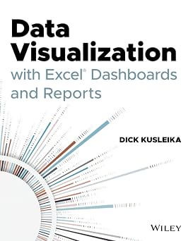
Data Visualization with Excel Dashboards and Reports
Data Visualization with Excel Dashboards and Reports
Large corporations like IBM and Oracle are using Excel dashboards and reports as a Business Intelligence tool, and many other smaller businesses are looking to these tools in order to cut costs for budgetary reasons. An effective analyst not only has to have the technical skills to use Excel in a productive manner but must be able to synthesize data into a story, and then present that story in the most impactful way. Microsoft shows its recognition of this with Excel. In Excel, there is a major focus on business intelligence and visualization. Data Visualization with Excel Dashboards and Reports fills the gap between handling data and synthesizing data into meaningful reports. This title will show readers how to think about their data in ways other than columns and rows. Most Excel books do a nice job discussing the individual functions and tools that can be used to create an "Excel Report". Titles on Excel charts, Excel pivot tables, and other books that focus on "Tips and Tricks" are useful in their own right; however they don't hit the mark for most data analysts. The primary reason these titles miss the mark is they are too focused on the mechanical aspects of building a chart, creating a pivot table, or other functionality. They don't offer these topics in the broader picture by showing how to present and report data in the most effective way. What are the most meaningful ways to show trending? How do you show relationships in data? When is showing variances more valuable than showing actual data values? How do you deal with outliers? How do you bucket data in the most meaningful way? How do you show impossible amounts of data without inundating your audience? In Data Visualization with Excel Reports and Dashboards, readers will get answers to all of these questions. Part technical manual, part analytical guidebook, this title will help Excel users go from reporting data with simple tables full of dull numbers, to creating high-impact reports and dashboards that will wow management both visually and substantively. This book offers a comprehensive review of a wide array of technical and analytical concepts that will help users create meaningful reports and dashboards. After reading this book, the reader will be able to: Analyze large amounts of data and report their data in a meaningful way Get better visibility into data from different perspectives Quickly slice data into various views on the fly Automate redundant reporting and analyses Create impressive dashboards and What-If analyses Understand the fundamentals of effective visualization Visualize performance comparisons Visualize changes and trends over time Published By John Wiley & Sons on 2021-02-17
Book Specifications
Book Title
You are viewing an alternative format/edition for this title. You can proceed directly to this book's page to complete your purchase.
More Books By Dick Kusleika
People who bought this also bought

Kenya: Between Hope and Despair, 1963-2011 Book by Daniel Branch
After the Sheikhs: The Coming Collapse of the Gulf Monarchies book by Christopher Davidson
Why Should Anyone Be Led by You?: What It Takes To Be An Authentic Leader book by Rob Goffee , Gareth R. Jones
Beyond Success: The 15 Secrets of a Winning Life! book by Brian D. Biro
Where Was God on September 11: Seeds of Faith and Hope book by Donald B. Kraybill
The Spirit Level: Why Greater Equality Makes Societies Stronger book by Richard G. Wilkinson
Things No One Taught Us About Love: How to Build Healthy Relationships with Yourself and Others book by Vex King
A Photographic Guide to Snakes and Other Reptiles of Southern Africa book by Bill Branch
The Motive: Why So Many Leaders Abdicate Their Most Important Responsibilities book by Patrick M. Lencioni
Love for Imperfect Things: How to Accept Yourself in a World Striving for Perfection book by Haemin Sunim
The Greatest You: Face Reality, Release Negativity, and Live Your Purpose book by Trent Shelton